Case study · Designer & Engineer · Open source · Personal
Pixelore UI
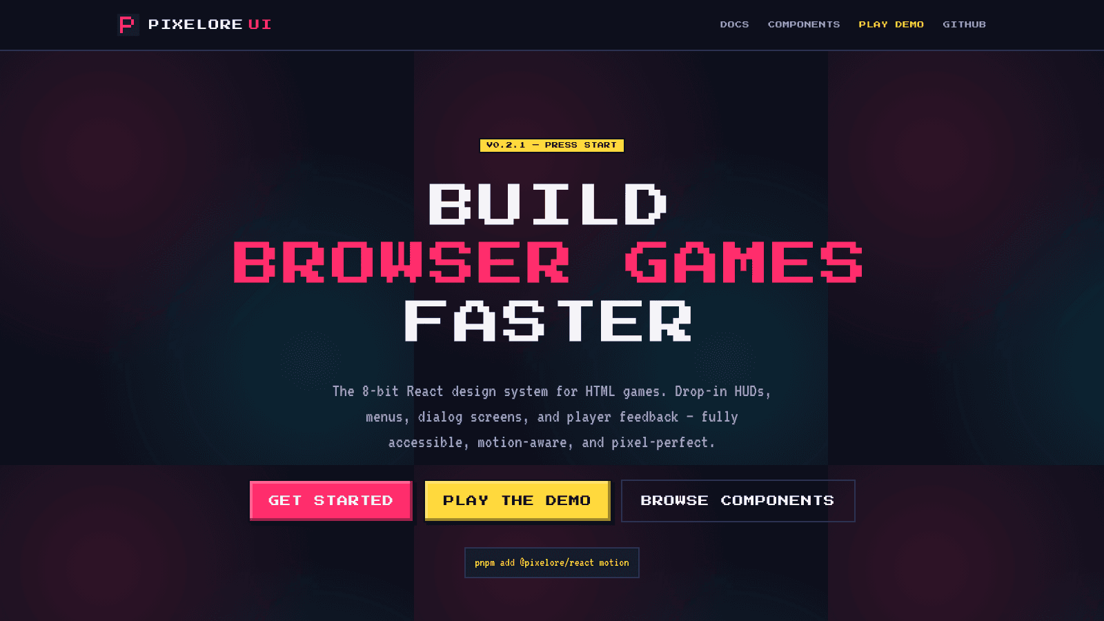
- A React design system with an 8-bit aesthetic, published to npm as @pixelore/react under MIT.
- 18 components on Radix primitives, targeting WCAG 2.2 AA, with two distribution paths so it drops into any React stack.
- Proven by a complete turn-based RPG built on top of it.
The problem
Every mainstream React design system is built for the same thing: a dashboard. shadcn, MUI and Chakra all assume flat surfaces, restrained motion and product UI. That is the right default for most of the web, and it is wrong in every direction if you are building a browser game.
The alternatives were worse. Pixel-art CSS kits exist, but they are mostly unmaintained and none of them have an accessibility story. The remaining option is rolling your own, which means re-solving keyboard navigation, focus management and ARIA for every primitive, badly, while you are trying to build a game.
Pixelore is the third option: the aesthetic of a 1989 platformer with the engineering of 2026.
Constraints
A component library is a public API. The moment someone imports Button, its props are a contract, and there is no honest way to change that contract except semver and a changelog.
Games are full of motion, and motion is exactly what vestibular disorders punish. Reduced motion could not be a switch bolted on at the end.
Pixel art dies under anti-aliasing. Anything drawn as a font glyph or a scaled SVG goes soft at the wrong size, which defeats the entire aesthetic.
Decisions and trade-offs
Radix UI primitives under every interactive component
Instead of hand-rolled ARIA and keyboard handling, because keyboard navigation, focus trapping and ARIA are solved problems, and getting them subtly wrong is invisible until someone arrives with a screen reader.
The cost a dependency behind each primitive, and the styling layer has to work with Radix's DOM structure rather than one I would have chosen.
Two distribution paths: a stylesheet, or a Tailwind v3/v4 preset
Instead of a single Tailwind-only entry point, because consumers already on Tailwind want to extend the theme tokens, and consumers who are not should not have to adopt it to use a button.
The cost two public surfaces to keep in sync, so every token change happens twice.
Reduced motion enforced at the CSS layer and the JS layer
Instead of only branching on `useReducedMotion` in components, because the global CSS cap catches transitions the library does not own, while the JS branch lets each animation swap to a meaningful substitute. Translates and scales become opacity, so the user still gets feedback.
The cost the rule lives in two places, and whoever adds an animation has to remember both.
tsup for the build, Changesets for releases
Instead of a hand-configured Rollup pipeline and manual version bumps, because a library needs ESM, CJS and type declarations from one config, and semver, changelog and npm publish belong in one tool rather than in someone's memory.
The cost less control over the output than a bespoke bundler config would give.
Architecture
pixelore/
├── packages/
│   ├── react/              @pixelore/react: the component library
│   │   └── tsup ──────────▶ ESM + CJS + .d.ts
│   └── tailwind-preset/    @pixelore/tailwind-preset: v3 & v4 presets
├── apps/
│   ├── docs/               Next.js 16 + MDX documentation site
│   └── rpg-demo/           the RPG that exercises every component
├── .changeset/             semver, changelogs, npm publishing
└── .github/workflows/      CI

   Radix primitives ──▶ behaviour (keyboard, ARIA, focus)
   Tailwind v4 @theme ──▶ tokens
   Motion 12 ──▶ animation, branching on useReducedMotion
The library and the preset are separate packages because they have separate audiences: one is for consuming components, the other is for extending the theme. The docs site and the RPG both build on the published package, so they catch API breakage before anyone else does.
What shipped
- 18 components, including the signature HeartBar, plus Button, Card, Input, Dialog, Tabs, Tooltip, Switch, Checkbox, RadioGroup, Progress, Alert, Avatar, Badge, Label, Separator, Skeleton and Textarea.
- Published on npm as @pixelore/react under MIT, versioned and released through Changesets.
- WCAG 2.2 AA targets across the default theme, with the focus accent at 4.5:1 on every surface.
- A documentation site on Next.js 16 and MDX, and a complete playable RPG consuming the package.